Sunday, December 12, 2010
The Most Disorganized Toy Store in Movie History
Silent Night, Deadly Night (1984) is notorious for the uproar it caused when released. Groups like the PTA were a appalled at the notion of a killer dressed as Santa Claus.
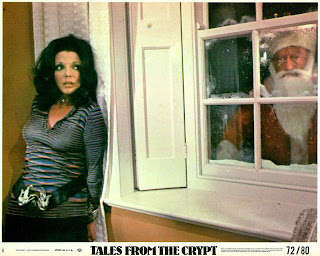
Actually the idea of a killer Santa Claus wasn't new. More than a decade earlier a segment of Tales From The Crypt (1972) features a psycho Santa terrorizing Joan Collins, and nobody freaked out. Well maybe someone did, but it wasn't the stink that Silent Night, Deadly Night created.
Anyway, I'm not here to talk about killer Santas, I'm here to talk about the most messed up toy store ever filmed. A major section of Silent Night, Deadly Night takes place at a quaint little store named IRA'S TOYS...
The reported budget for Silent Night, Deadly Night is well under one million dollars. It's obvious the set decorator had little money to work with, and no doubt they were on a very tight time schedule too. So under these difficult circumstances how successful were they at creating a convincing toy store? Let's take a look around, and see what we find.
As first glance I think the above pic might look like the toy store's storage room with all those random brown cardboard boxes (and throughout the store too), but it's not. Just for the record this is the stock room...
Now back to the retail space...
At Ira's they conveniently pre-inflate the inflatable pool toys for you. Also it helps to fill all that shelf space.
Although it's Christmas time, at Ira's they still have the Halloween costumes on display. Actually I assume they keep them up year-around.
There's some famous characters here. I can see Batman, Spider-Man, a couple of Mickey Mouse masks...
... and G.I. Joe - who gets a prominent shot.
It's also Easter time at Ira's Toys, or at least I always associate these insane looking inflatable rabbits with Easter.
It's Poochi! You know, for girls.
They pre-assemble the Mr. and Mrs. Potato Heads at Ira's. That's unique customer service.
If you're looking for Jabba the Hutt you're in luck. Ira's is well stocked on this item, but you better hurry if you want that Patrol Dewback. Hey where are the Star Wars action figures?
If you look closely, you can see the figures tucked away on the right.
Want to purchase the game Twister? Try checking behind the Smurf puzzle. Also note the partially hidden Popeye the Movie board game.
This is an interesting shot for the curious way this store is organized. There's the Mouse Trap games on the top self, assorted preschool toys below, and a Habitrail set for your pet hamster on the upper left .
Please forgive the actor's awkward pose, but this is the bottom shelf of where the Star Wars toys are located. Here you'll find the Monroe Dollhouse Kit and the Motorific Torture Track which is a toy from the 1960's...
I thought I noticed something else in that last shot, it's the Krull board game on the lower left.
For such a small and disorganized store Ira's has its own Santa Claus "meet 'n greet" that's reasonably elaborate. This is something only malls and big city department stores usually have.
Well I could go on and on, but why beat a dead reindeer. I'll conclude this post with this wide shot of Ira's Toys. See if you can spot your favorite toy among the clutter, or feel free to make your own snarky comment.
Oh wait, it's a He-Man and Battle Cat kite! And a possible spoiler, sorry if you looked.
Labels:
board game,
movie,
retro,
toy
Thursday, December 2, 2010
A Change of Seasons
It's that time of year again, and that means it's time for the holiday classic A Change of Seasons (1980).
Man, I love it when TNT plays this movie for 24 hours straight starting on Christmas Eve... OK, I'm teasing.
I don't think anyone even thinks about this film anymore. Not even the people who made it.
In 1980 this was a "big" holiday movie for 20th Century-Fox. I'm not kidding, take a look at this pull-out poster promotion which was published in national magazines...
Oh hey, it's a naked and wet Bo Derek. Now that she's caught our eye, let's turn the page and see what else we can find...
No more Bo, but we now have Anthony Hopkins and Shirley MacLaine in bed. This is all sorta like a comic book version of the trailer.
On the third page is more of the cast, and more of the "lover" talk. Wow that word is way overused here. Do people even use that word much anymore? I think it makes everything sound rather dated.
Just to be complete here's the last page which has a short bio on the principle actors...
Finally let's open this thing up and take a look at the poster...
It's a fun poster with an all naked cast, and a cartoon-ish leering bear rug and moose head wearing a Santa hat. This movie looks like a wacky sex comedy.
The poster art is by Robert Tanenbaum, and this is one of the last movie posters he worked on before moving on to other things.
Maybe Robert just gave up working on movie posters in disgust because his poster art wasn't officially used for this film. If you visited a movie theater 30 years ago this was the poster you saw for A Change of Seasons.
It's no longer the wacky comedy, but something more sexy and sophisticated. The marketing people took a shot from the infamous "hot tub scene," and replaced the leering bear and moose with a pic of a leering Shirley MacLaine.
It's not as fun as the illustrated poster, but at least it was better then this budget tri-color poster. I don't know exactly what's going on with composition here, but they sure want you to know Bo Derek is in this film - she's pictured on this poster three times...
Here's the provocative Swedish poster which uses a more risque "hot tub scene" picture, and a pair of illustrated disembodied human legs engaged in some kind of adult activity. According to the Google Translator the title reads "talk about left-rustling" whatever that means...
A Change of Seasons is available on DVD, and the cover art is very conservative and uninspired. The hot tub pic is colorized and placed in the background, and thee photos of stars placed prominently in the foreground. Also it now looks like a very autumn-like movie to me...
Lastly here's A Change of Seasons poster from Turkey? India? I have no idea...
That artist is no Robert Tanenbaum, and that image of Bo is not from this film either. It's from one of Bo's many sexy photo shoots...
Well this concludes my most steamy blog post ever, and just in time to kick of the jolly holiday season too.
Merry Christmas fellas.
A CHANGE OF SEASONS: Movie Trailer. Watch more top selected videos about: Mary Beth Hurt, Richard Lang
Man, I love it when TNT plays this movie for 24 hours straight starting on Christmas Eve... OK, I'm teasing.
I don't think anyone even thinks about this film anymore. Not even the people who made it.
In 1980 this was a "big" holiday movie for 20th Century-Fox. I'm not kidding, take a look at this pull-out poster promotion which was published in national magazines...
Oh hey, it's a naked and wet Bo Derek. Now that she's caught our eye, let's turn the page and see what else we can find...
No more Bo, but we now have Anthony Hopkins and Shirley MacLaine in bed. This is all sorta like a comic book version of the trailer.
On the third page is more of the cast, and more of the "lover" talk. Wow that word is way overused here. Do people even use that word much anymore? I think it makes everything sound rather dated.
Just to be complete here's the last page which has a short bio on the principle actors...
Finally let's open this thing up and take a look at the poster...
It's a fun poster with an all naked cast, and a cartoon-ish leering bear rug and moose head wearing a Santa hat. This movie looks like a wacky sex comedy.
The poster art is by Robert Tanenbaum, and this is one of the last movie posters he worked on before moving on to other things.
Maybe Robert just gave up working on movie posters in disgust because his poster art wasn't officially used for this film. If you visited a movie theater 30 years ago this was the poster you saw for A Change of Seasons.
It's no longer the wacky comedy, but something more sexy and sophisticated. The marketing people took a shot from the infamous "hot tub scene," and replaced the leering bear and moose with a pic of a leering Shirley MacLaine.
It's not as fun as the illustrated poster, but at least it was better then this budget tri-color poster. I don't know exactly what's going on with composition here, but they sure want you to know Bo Derek is in this film - she's pictured on this poster three times...
Here's the provocative Swedish poster which uses a more risque "hot tub scene" picture, and a pair of illustrated disembodied human legs engaged in some kind of adult activity. According to the Google Translator the title reads "talk about left-rustling" whatever that means...
A Change of Seasons is available on DVD, and the cover art is very conservative and uninspired. The hot tub pic is colorized and placed in the background, and thee photos of stars placed prominently in the foreground. Also it now looks like a very autumn-like movie to me...
Lastly here's A Change of Seasons poster from Turkey? India? I have no idea...
That artist is no Robert Tanenbaum, and that image of Bo is not from this film either. It's from one of Bo's many sexy photo shoots...
Well this concludes my most steamy blog post ever, and just in time to kick of the jolly holiday season too.
Merry Christmas fellas.
Thursday, November 25, 2010
Variations on a Thanksgiving Theme
Norman Rockwell's iconic "Thanksgiving Painting" titled Freedom from Want appeared in The Saturday Evening Post on March 6, 1943. This was Rockwell's third installment of his famous Four Freedoms series.
Now with that bit of history out of the way, what was the first Freedom from Want parody?
I have no idea, maybe you can tell me, but there sure are a lot of them. When I saw someone post one of these parodies earlier today I thought I might try my hand at compiling a list of as many of these parodies I could find.
Although I quickly learned compiling a list of Rockwell parodies is nothing new. Other bloggers have beaten me to the punch, here on November 27, 2008, and here on November 24, 2008. So now here in 2010, I'm not only a copy-cat, but also rather late. Well imitation is the sincerest form of flattery, and hopefully I can at least bring a little something new to the party.
MAD Magazine is famous for their parodies so we might as well start with them...
It looks like The Simpsons invited Barny to their Thanksgiving dinner, and told Selma to stay home. I'd guess this picture comes from one of the Simpsons calenders.
A DC Comic superhero Thanksgiving was depicted on the #54 issue of JSA.
Marvel Comics gets in on the act too with the Fantastic Four'sThanksgiving Christmas dinner.
This might be a good time to show something from talented comic book artist Joe Phillips. When he's not working for DC Comics Joe likes to draw hot young men who enjoy hanging out with other hot young men. Joe gets extra bonus points for adding ham and wine to the dinner table. Also I'm a Frank Lloyd Wright fan so I can appreciate the dining room remodeling as well...
From Disney it's the happiest Thanksgiving dinner table on earth. Although who the heck invited Br'er Bear? Isn't he sorta a villain? Oh well it's the holidays, and he's not truly evil...
And since the Muppets are a part of the Disney Company here's their Turkey Day dinner, but that ain't no turkey. It looks way under done, and probably tastes like felt and foam rubber.
I didn't want to include any non-professional or home-made works in this list (there are a lot of people out there who've done their own family photo recreations), but these next two are very good.
This next one I assume was published somewhere, but who knows. This seems like a excellent illustration for a article about non-traditional family holidays. Also is that bacon on that turkey?
Now here's someone who has Photoshoped Freedom from Want to depict a redneck Thanksgiving. It's pretty genius work even if granny's cleavage looks a little wonky. Well I guess she's not a spring chicken any longer.
Lastly here's a picture I had in mind when I decided to do this post in the first place. I hadn't seen it since I was a kid, but I thought I remembered a punk rock Rockwell parody on the cover of the National Lampoon. Luckily I was able to find that cover, but it's not really a parody of Freedom from Want. Still it's a funny and extremely well done illustration.
Happy Thanksgiving!
Now with that bit of history out of the way, what was the first Freedom from Want parody?
I have no idea, maybe you can tell me, but there sure are a lot of them. When I saw someone post one of these parodies earlier today I thought I might try my hand at compiling a list of as many of these parodies I could find.
Although I quickly learned compiling a list of Rockwell parodies is nothing new. Other bloggers have beaten me to the punch, here on November 27, 2008, and here on November 24, 2008. So now here in 2010, I'm not only a copy-cat, but also rather late. Well imitation is the sincerest form of flattery, and hopefully I can at least bring a little something new to the party.
MAD Magazine is famous for their parodies so we might as well start with them...
It looks like The Simpsons invited Barny to their Thanksgiving dinner, and told Selma to stay home. I'd guess this picture comes from one of the Simpsons calenders.
A DC Comic superhero Thanksgiving was depicted on the #54 issue of JSA.
Marvel Comics gets in on the act too with the Fantastic Four's
This might be a good time to show something from talented comic book artist Joe Phillips. When he's not working for DC Comics Joe likes to draw hot young men who enjoy hanging out with other hot young men. Joe gets extra bonus points for adding ham and wine to the dinner table. Also I'm a Frank Lloyd Wright fan so I can appreciate the dining room remodeling as well...
From Disney it's the happiest Thanksgiving dinner table on earth. Although who the heck invited Br'er Bear? Isn't he sorta a villain? Oh well it's the holidays, and he's not truly evil...
And since the Muppets are a part of the Disney Company here's their Turkey Day dinner, but that ain't no turkey. It looks way under done, and probably tastes like felt and foam rubber.
I didn't want to include any non-professional or home-made works in this list (there are a lot of people out there who've done their own family photo recreations), but these next two are very good.
This next one I assume was published somewhere, but who knows. This seems like a excellent illustration for a article about non-traditional family holidays. Also is that bacon on that turkey?
Now here's someone who has Photoshoped Freedom from Want to depict a redneck Thanksgiving. It's pretty genius work even if granny's cleavage looks a little wonky. Well I guess she's not a spring chicken any longer.
Lastly here's a picture I had in mind when I decided to do this post in the first place. I hadn't seen it since I was a kid, but I thought I remembered a punk rock Rockwell parody on the cover of the National Lampoon. Luckily I was able to find that cover, but it's not really a parody of Freedom from Want. Still it's a funny and extremely well done illustration.
Happy Thanksgiving!
Labels:
Norman Rockwell,
Thanksgiving
Tuesday, November 23, 2010
The Koogle Conundrum
And so another small piece of the great Koogle puzzle falls into place with this post.
What the heck is Koogle you might ask?
Koogle was a flavored peanut butter manufactured in the 1970's by Kraft Foods. Let's take a look at the commercial...
In researching this post I couldn't find anyone on Internet who actually liked this stuff. It seems this was the type of product you begged your mother to buy, and then once you tried it you didn't want it ever again.
Koogle was featured in the fun book Krazy Kids' Food co-authored by personal Internet acquaintance Dan Goodsell.
On page 158 is a picture of a vacuum formed store display of the Kooglenut monster and page 159 is a jar of the chocolate flavored Koogle.
There's a lost commercial featuring the Kooglenut monster that would be sure swell to see. Hopefully a resourceful YouTuber will upload it one day.
Anyways here's my addition to the Koogle Internet Archives - a scan from the lid of a jar of Vanilla Koogle.
Partially hardened vegetable oils must be 1970's speak for partially hydrogenated vegetable oil. Sugar and dextrose is technically the same thing - so this is like Sugar². This stuff must have tasted sickeningly sweet.
Labels:
commercial,
food,
retro
Thursday, November 18, 2010
Sandwich Bodybag
Most of my posts are usually about some old
Recently I wanted sandwich bags at a good value, and so what better choice than Value Choice Sandwich Bags. At $1.09 for a box of 150 bags that's less than a penny per bag. What a great deal!
At that price who cares about package designs, but as an added bonus I got this unique "sandwich man" cartoon printed on the box.
I'm sure "sandwich man" is perfectly happy wrapped in plastic. He's just relaxing and keeping fresh until it's time to be eaten. "Sandwich man" probably feels a lot like how another once popular cartoon mascot felt about being consumed by humans...
I never understood why Charlie the Tuna was so determined to be caught and taken to the cannery where he'd be gutted, butchered, cooked, chopped-up and packed into cans of Star-Kist Tuna. Maybe the ocean is a depressing place to live. I guess Sebastian the Crab was lying when he sang about how great it was to be "Under the Sea."
Anyway if you look at the bottom of the box you can learn about many other uses for these fine sandwich bags, and the company who manufactures these bags...
The Nash Finch Company are the makers of this and may other quality products sold at independent grocery stores across this country.
It looks like this package was designed in 2002. Who knows how long this package design will last, but for any future redesigns I hope they keep "sandwich man" alive. Or something like that.
Labels:
packaging,
sandwich bags
Saturday, November 13, 2010
Hardee's Ghostbusters II Poster
Although this post is titled "Hardee's Ghostbusters II Poster," I'm technically not going to show the actual poster.
Say what? That's crazy talk.
Seriously, the poster is nothing special. It's simply the Ghosterbusters II logo. What might be more interesting, or quasi-interesting, is the other stuff printed on the poster.
In 1989 Hardee's was the "Official Ghostbusters Headquarters" as you can see from the "cover" of their collector poster below...
Probably the most memorable part of Hardee's Ghostbusters II promotion was the recall of the "Ghostblasters" electronic noisemaker due to the fact some children were swallowing the batteries. I have a couple of those noisemakers tucked away somewhere, and after all these years have somehow managed to keep from swallowing the delicious batteries myself.
Anyways, when you open the collector poster you a vague - make that a very, very vague description of Ghostbusters II with a list of the returning stars...
... the "back" has virtually nothing on it.
This poster was given away for free, and had three different food coupons at the bottom.
Only 39¢ for a cone? That's a deal! Today, these old coupons might be the most interesting thing about this poster.
UNCANNY COINCIDENCE UPDATE: Just as I published this post, "Quint" over at Ain't It Cool News conveniently posted a behind the scenes photo from Ghostbusters II. Click here to check it out. This happily makes this lame-ish post a little less lame.
Labels:
movie,
poster,
restaurant
Saturday, November 6, 2010
Star Wars Funmeal
Here are two Burger Chef Star Wars Funmeal packages from 1978 for your viewing pleasure. The Funmeals didn't come with a toy, but the packages are printed with punch-out vehicles that you could put together.
First is Luke's Landspeeder...
... and don't forget the parts on the bottom of the package.
Next is next the X-Wing Fighter...
... and the bottom.
Burger Chef's mascots were the Burger Chef and his young protege Jeff. On the vintage tray liner below Burger Chef explains to Jeff how the salad was invented...
Gee, who knew primitive cave people were dumber than rabbits. How did the human race ever survive?
To close this post here's a Burger Chef commercial featuring Burger Chef and Jeff and their new "Works" and salad bar.
Labels:
restaurant,
star wars funmeal
Subscribe to:
Posts (Atom)